Amazon.com

Now what’s so special about this? Just the name of the company with a normal swoosh – something which is used very often when it comes to logo designing. But wait a second, doesn’t that swoosh look like a smile? And it points from A to Z. That’s right, you got the hidden meaning. The arrow pointing from A to Z signifies what Amazon is famous for and that is selling anything and everything. The smile essentially implicates a customer’s emotion after shopping on the site and that is of happiness.
Baskin Robbins
In the year 2005 this famous ice cream brand completed its sixty years. A part of the celebrations the ice cream company came out with a new logo. If one remembers the older sign had the number “31” appear on it’s logo with an arc which signified a scoop of ice cream. So have figured out what we are talking about or should I make it obvious. Well look closer the “31” is still there. It forms as part of the pink portion of the two initials of the company that are present in the logo.
Big Ten Conference
Most of you must have heard about this academic union. This union, which was founded in the year 1896, has under it the top academic universities all over the world which share a common interest in research and development on the graduate and undergraduate level. From the year 1949 up till 1990, the big ten consisted of ten universities. On 4th of June 1990 it also included the Pennsylvania State University into the conference. The name of the union remained the same but if one is observant then the person could easily make out the number “11” over the blue region next to G and T.
Body Wisdom
This logo comprises two hands wide open and sticking to each other, and at the same time there are two white circles in between. These circles look something like an owl’s eyes. This spa centre is represented with hands, which basically play an important role at a spa, as they do the massage. The owl eyes here represent wisdom, which relates to the name of the company itself.
Eight
Very smartly designed, all that this logo required was the number “8” which has been very intelligently used to make the integrate the word eight in the logo itself. It also shows a very brilliant concept of how numbers can be used to write words. Very careful use of the number in only black colour gives the logo a stylish look. Anyone looking at the logo will not need a second chance to identify the brand and relate the logo to it.
Families and Marriage magazines
A very clear logo, it displays the special relationship between families and marriages through its letters. The lower case ’i’s in “families” are shown in three different sizes, representing the man as the longest I followed by the woman and the child. Moving on to the second word in the logo, the upper case “R”s mirror each other with their ends sticking to each other, representing the bond of a relationship. Altogether, the logo provides a very emotional appeal.
Forkwire
This online food delivery logo includes a combination of the internet key @ with fork in it, representing food as well as the first half of the name – fork, making the utilization of technology in food delivery very clear and obvious for the customers. Also, a white writing on a red background is catchy enough for the customer and gives an elegant look to the logo.
FedEx

First look at the FedEx logo and you think what’s so unique about it? It is just a simple, you could say, a more or less textual symbol. But wait! Look closer. Do you notice a hidden arrow somewhere? This logo was created by Linden Leader & Landor associates in the year 1994 and on the first look comes forward to be a very simple design. But if you pay attention then you find that in between the E and the X is a right handed arrow. This hidden sign apparently signifies the precision and the speed at which this world famous courier company works.
Fuga
This is a logo for an architectural organization. The logo looks more like a maze in alternative colors of peach and brown. But if looked at carefully, the white stripes in the middle that look like the paths of the maze are the lines that form the name “fuga”. The font styling and use of colors does the work for this logo, thus making it interesting to look at.
GoodWill Industries

The GoodWill industries logo is a very simple combination of two bold colors, blue and black. However, one can see the intelligent designing of the logo by usage of just the lower case of the letter ‘G’- ‘g’ which is also the first initial of the company’s name. The lower case ‘g’ also represents a smiley face thus giving a very positive image to the industry. So even if you see the smiley face before the initial ‘g’, it simply means that GoodWill has goodwill.
Hartford whaler
The name is very much present in the logo, with most of its important initials. On first look, you can notice the tails of a whale in blue, which connects to the name. A “W” of the Whalers is made in green, which holds an “H” inside it. The very cleverly opened logo spells out the name of the company, “Hartford Whalers”, making it a very indicative logo indeed.
Heartbeats
This brand holds a very obvious but cute logo, made out of musical notes joined at their ends making them look like a heart and headphones at the same time. This creates a strong link of the logo with the music as well as represents the love of music lovers. Use of soft colours like pink and purple gives a feeling of happiness and joy on seeing this logo, just like the one you get on listening to good music. The logo designed is simple but very relevant to the brand.
Lafyette Galleries
The very prominent cursive handwriting used to write “Lafyette” shows style and elegance in the brand. The two “t”s are tilted towards each other making a tower, which gives an indication of the origin of the brand. The “t”s represent the Eiffel tower, thus making Paris the home of the brand. Decent use of red and black leaves a stylish look with the logo, which goes hand in hand with the brand.
Mosleep
Mosleep as the name suggests is an organization of doctors that deals with people having sleeping disorders. The logo, for this company is an “M” that represents the initials of the company’s name. Along with representing the company’s name, the “m” also looks like a bed, which is very much in relation to the idea of sleeping, thus explaining the core concept of the organisation’s work, which is to deal with sleeping problems.
NorthWest Airlines
The logo shown on your left is the logo that was replaced a few years back with a new one by the airlines company. Well you must be wondering what is so special about this logo that has now been replaced with a newer one. This one is fairly easy to figure out. It is considered a piece of genius by many. The pink circle houses an N along with a W with a pointer (compass) pointing to the North West direction.
Sun Microsystems
This masterpiece which was developed by Mr Vaughan Pratt – a professor at the famous Stanford University, successfully and beautifully integrates four interlocked copies of the keyword “sun”. This logo is a perfect example of an ambigram – which is defined as a typographical work of art which can be read as one or more than one word in its original form and also from other angles and viewpoints.
Toblerone
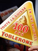
This world famous chocolate with a triangular shape was produced in the year 1908 by Theodore Tobler and Emil Baumann in the city of Berne, Switzerland. In the year 1970, the Matterhorn Mountain was included into its logo. Today the latest version of the logo consists of a bear camouflaged in the mountain. Is there anything significant about the bear? Well, YES! The bear is the symbol that signifies the city of Berne which is the birthplace of this chocolate.
Yoga Australia

At first, the logo appears to be of a girl doing yoga, but on careful observation, one can see the map of Australia where she holds her leg in the air. A very beautiful concept has been displayed in the logo, where an attempt of holding the nationality of the brand along with the logo is made. The posture of the girl has imbibed in it the map of the country the company belongs to. From what we can see, the attempt has been successful.
ZIP logo

This logo is very simple and clear in reference to the brand name. The drawing of a zip in place of an “i” shows very obvious display of the company’s name. The designer Mark Erickson uses the zip in the “i” to connect Z and P. Raw use of black and white adds to the seriousness of the brand. The logo is very precise, simple and to the point.
Pakuy
Designed by Maumer, the logo of this company consists of a simple “p” made of unfolded carton cover or a broken box, thus representing the work of the brand which is packaging. The letter ‘p’ is also the initial of the company’s name and it thus suits the name as well.

Eighty-20 is a small consulting company which does sophisticated financial modeling, as well as some solid database work. All their work is highly quantitative and relies on some serious computational power, and the logo is meant to convey it.

This was a logo created for a puzzle game called Cluenatic. This game involves unravelling four clues. The logo has the letters C, L, U and E arranged as a maze. and from a distance, the logo looks
Elle Hive Logo |
 |
| Designer - Toni |
| It is a company which designs compact tractors. The letters “E” and “H” make up the image of a tractor. |
Toblerone Logo |
 |
| One of my favorite chocolates…yummy!! But trust me I never noticed the brilliant logo while enjoying my bar. You must be thinking what is there to find out as it clearly shows the Swiss Alps? Let me explain…Toblerone originated in Bern, Switzerland - A city whose name is rumored to mean, “City of bears”. When you look at it again you will find a bear in the logo. |
Logo !N3K8 |
 |
| The complexity of this logo is its beauty. It is a business and IT consulting company based in the UK and the logo is a combination of numeric and alphabets to explain the word “intricate”. |
Review Logo |
 |
| Designer - Sean Farrell Logo Design: |
| When you take off a piece of the “v” in the word “review” it forms a check mark (for review). Simply amazing!! |
Hartford Whalers |
 |
| The logo shows 3 concepts at the same time. A whale’s tail, letter “W” in green and the white space forming an “H” for Hartford. |
VIA Rail Canada Logo |
 |
| Notice carefully…the VIA rail Canada logo makes two train tracks with the letters” V” and the “A”. The alphabet “I” is the division between the two. A simply brilliant logo. |
Piano Forest Logo |
 |
| Designer: Jason Cho |
| The designer gives the message in a subtle but evident manner by shaping piano keys like trees to resemble a keyboard/piano. |
ED Logo: Gianni Bortolotti |
 |
| Designer - Josiah Jost |
| The designer of ED Logo – “Elettro Domestici -Home Appliances” in English, changed the concept of traditional logo designing through this logo. The designer has amazingly used the negative space to demonstrate the letter “E” and “D” making the logo look like an electric plug. |


