Simple rules for good typography
Here are some basic rules to improve your typography across either web or print. Of course, these rules are only to start with, and rules are meant to be broken. But if you want something to look neat, clean and generally well designed they are a good set to follow.Don’t use too many typefaces
Consistency throughout a document or website is helpful. It brings unity and one identity. It also makes it clean, tidy and just basically not messy. A good rule to follow then is to not use more than 3 different typefaces in one document.

Hierarchy
It is always important in typography to pay close attention to the hierarchy of the page. The most basic thing is to keep the headline at the top of the page in a larger size. But more than this its just a case of looking at the page and asking other people what they read first. As a designer we should be thinking about communication constantly. This is our primary focus.

Font size
Use no more than 4 font sizes in a document or website. Preferably 3. Again this is a case of consistency. Too many copy sizes make a document disjointed. 3 also allows enough variation to emphasise certain text and categorise text together. For example, you have one size for a heading, one for an introduction, one for body text and one for a pullout quote or something else. This will be consistent across the whole
8-10pt for body copy
Always keep body point between between these sizes. It looks neat and tidy and allows headings. Definitely do not go over 12pt.
A typeface not legible is not a typeface
There is a place for all kinds of artistic typefaces, but for good standard copy lets keep things simple people. It must be legible. This is certainly the case for body copy. Keep experimental typefaces for posters or at best headlines. They are never well received in large quantities. Can you read this easily?

Leading
Leading is essentially the vertical space between the lines of type. Leading is something that so many designers forget about, its easy just to stick with the auto settings. But trust me, this can make or break a document. Pay close attention to your leading. I personally like to keep my leading tight, but without ever overlapping. Usually I will go for a little above the font size, slightly below the auto setting. This works especially well with helvetica like typefaces. Either way, there should not be too much space, and the letters should not overlap at all!

Kerning
Kerning is the spacing between letters. Again, like leading this seems like an obvious one, but still needs careful attention. Consider if your typeface generally needs spacing out more, or if it looks better with tighter kerning. I always prefer helvetica and futura manually tightened as they have quite a bit of space between letters on the normal setting. Also it is worth taking special care with specific characters. Again, no characters should overlap. An example of this is for helvetica r and t characters together. Be worth kerning manually in this case.

Accent or emphasise
This can help bring out key words and also break up large sections of text. Large chunks of copy tend to be quite scary, and ideally people like to skim. A subtle emphasis can bring out key words. A different colour, slightly darker perhaps or a slightly bolder version of the font are nice techniques.
Do not over emphasise
Emphasis in a body of text should be kept simple and elegant. I either use bold, italic or underlined. Too much, just makes a page look messy.

No caps in body text
This one is simple enough. Never use capitals in body copy, it is just not as legible. Enough said.
Always align to a baseline
Keep text in simple horizontal lines. This is another body text rule and again seems pretty obvious. Ideally you use a baseline grid throughout. More details of how to that here.

Flush left ragged right
Always keep the text left aligned and don’t justify. This is legible and does not look messy. Justifying text across a smaller column especially creates massive gaps or ‘rivers’ in the type. Don’t do it.

Lines not too long or short
Line length is also important. It helps legibility and prevents your eye from slipping up or down a line in a large body of text. My rule is do not have less than 6 words or more than 12 in a single line. Use columns in a page to make this structured and easy. Your page will be neater and more legible.
Punctuation and Bullet points
Punctuation marks and bullet points are something which is easily forgotten in typography. Modern design software does not make it easy for us to handle this correctly. Bullet points, should ideally be in the page margin. Not indented. Likewise, punctuation marks should be in the margin as well. The image below from Mark Boultons site illustrates this perfectly. You can see a tutorial for bullet points here, and punctuation marks here.


The fibonnaci sequence
the first two Fibonacci numbers are 0 and 1 and each other number is a combination of the previous 2. These numbers are meant to have a natural visual elegance to each other. Since the Renaissance, many artists and architects have proportioned their works to approximate the ‘golden ratio’. Therefore in typography it is a good suggestion to consider using only these numbers to structure your chosen point sizes to. It will give your whole document a natural elegance.
0 1 1 2 3 5 8 13 21 34 55 89 144…
Conclusion
Typography is a massive subject and I am sure many will disagree with the suggestions I have made. Remember these rules are always made to be broken. With knowlege and experience comes the decision if it is appropriate to stick to or break these rules. These rules are kind of beginners guide to typography. Stick to them and I think you can’t go far wrong.
Hope you have found useful. If you have any to add, please leave a comment.
Five simple steps to better typography
 I’ve struggled a bit with the latest addition to this ‘simple steps’ typography series. Mostly because it’s not so simple and it’s a bit more of a grey area than the previous three articles.
First off a bit of history.
Early typographers created their manuscripts by using one font, one size, one colour mostly, interspersed with hand painted illuminations. The products of such typographers has a flat quality to the information, almost mesmeric.Take a look at some early manuscripts and the typefaces themselves, especially the older Black letter styles, appear similar — m’s look like u’s, y’s look like p’s and so on. As beautiful these manuscripts are, other than the illuminations, they are devoid of structure within the content. There is no typographic hierarchy.
Evolution of the scale
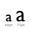
In the sixteenth century, European typographers developed a series of typeface sizes, a scale (the musical analogy is a good one — stick with me). As shown in the diagram they are sizes we’re are all familiar with. Six point through to Seventy-Two point type has remained pretty much intact for over four hundred years. In fact, they are the default font sizes in many applications (give or take a few.).
So, what’s so special about these sizes? Well, because this scale of sizes has been used for centuries, if set correctly, type set in this scale will appear more pleasing to the eye and therefore more legible.
An interesting point. Originally the sizes in the scale were referred to by name instead of by point size. here’s a few examples of some of the older names:
New software, and modern methods of typesetting, has allowed character heights which fall outside of, and within, this scale. this freedom has resulted in a typographic free for all, allowing designers to pick sizes which may not be related to one another as according to this scale. Is this a bad thing? I’d argue that it is.
Let’s go back to the music analogy. It’s like composing a discordant piece of music. Clashing notes, clashing type. but, if it’s clashing you’re after, that’s fine. If, however, you’re after harmony and melody that stands the hairs up on the back of your neck, stick to the notes in the scale folks!
Application of the scale
So let’s put some of this into practice. I’m going to be using this very website as an example.I started off designing this website with something very specific in mind — typography. I wanted to make sure this site would work by a simple, clear hierarchy of typography set against a simple modular grid, with plenty of white space on which to ‘hang’ a number of design elements (in my portfolio for example).
Following the typographic scale described in the previous section, I set about applying this to the CSS based design.
These are the elements for the typographic hierarchy. Note, I’m using pixels as my base measurement, not points. And yes I do know the pixel’s are different on different platforms.
The thing about type sizes in CSS is if you want to remain true to typographic tradition, you have to specify em’s or percentages based on an absolute unit of measurement, in this case a pixel. If you use the relative — small, x-small etc. — there aren’t enough declarations to complete the scale and the sizing of each increment is fixed at 1.5 going up the scale or 0.66% going down. (apparently this depends and was also changed to somewhere between 1.0 and 1.2 in CSS2.) But anyway, I don’t want to get fixated on the best CSS approach to this. This article is about typography.
These are the pixel sizes for my main headings:
- 11px /16.5px — Body copy and leading.
- 24px — Main heading used as section headings on the Homepage, Portfolio homepage and entries.
- 18px — Headings for journal entries and portfolio subheadings.
- 16px — All navigational and content tertiary headings.
- 13px — All other headed elements.
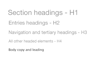
These translate into the following way into CSS, using percentages for scaling purposes.
- 11px /1.5em — Body copy and leading.
- 218% — Main heading used as section headings on the Homepage, Portfolio homepage and entries.
- 164% — Headings for journal entries and portfolio subheadings.
- 145% — All navigational and content tertiary headings.
- 118% — All other headed elements.
body {
font: 11px/1.5em "Lucida Grande";
}

h1, h2, h3, h4, h5, h6 {
font-family: helvetica, arial, verdana, sans-serif;
font-weight: normal;
}

h1 {
font-size: 218%;
}

h2 {
font-size: 164%;
}

h3 {
font-size: 145%;
}

h4 {
font-size: 118%;
}
Using these values for the size of the headings creates a natural relationship between them. The typography is harmonious as a result and it only took about five minutes to implement. Not long at all.Size really does matter
It really does. If you take anything away from this series, please let it be this. Stop and think about your type sizes, just for five minutes. Plan them, don’t just choose whatever you feel like from the dropdown in Photoshop. Make sure they are ‘in tune’ and then apply the theory to whatever medium you are designing to.Next up the series we follow on from this with weight.
The series
This is the fourth installment of this “Simple Steps…” series. Next up we have Typographic Hierarchy — weight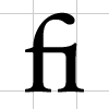
So, in an attempt to spread the word here’s the first of five simple steps to better typography. To kick it off, part one is about the Measure.
Measure the Measure.
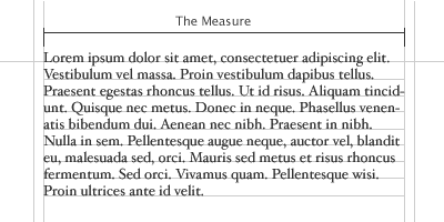
The Measure is the name given to the width of a body of type. There are several units of measurement used for defining the Measure’s width. The three basic units are:
- One point = 1/72 of an inch
- One pica = 12 points
- One em = The distance horizontally equal to the type size, in points, you are using. Eg. 1em of 12pt type is 12pt. (Thanks to Joe for correcting me on this.)
- Millimetres
- Pixels
CSS and fluid?
What is interesting here is fluid designs on the web. How can a Measure react to an increase and decrease in size. The entire grid would have to adapt to that change. An interesting discussion point and challenge.The Measure and leading.
A simple rule is your leading should be wider than your word spacing. This is because when the balance is correct, your eye will move along the line instead of down the lines.If your measure is wider than the guidelines for optimum legibility then increase the leading, or line-height as it’s sometimes wrongly called. This will have the effect of increasing legibility. Your leading should increase proportionally to your Measure. Small Measure, less leading. Wide Measure, more leading. It’s a simple but effective rule.
Reversing out?
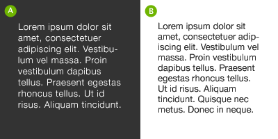
When reversing colour out, eg white text on black, make sure you increase the leading, tracking and decrease your font-weight. This applies to all widths of Measure. White text on a black background is a higher contrast to the opposite, so the letterforms need to be wider apart, lighter in weight and have more space between the lines.
Tracking
The general rule of thumb in tracking your words (not the characters) is that the shorter the line length the tighter the tracking, the opposite is also true.
Your responsibility
Following these simple rules will ensure your bodies of text will be as legible as they can be. These rules come from a typographic craft background which unfortunately, for our industry in particular, aren’t being taught as much as they should be in the art schools around the world. As a result they aren’t being practiced and correct, well-considered typography is taking a nose-dive.It’s our responsibility, as designers, to embrace the rules which are born of a craft which goes back hundreds of years.
Hopefully, this series of quick, sure-fire ways of improving your typographic craft will help in some way make sure computers and DTP doesn’t kill it off. That would be a great shame.
The series
This is the first installment of this “Simple Steps…” series. Next up we have Hanging punctuation- Measure the measure
anging punctuation is an area of typographic design which has suffered at the hands of certain software products. It’s a term which refers to glyph positioning to create the illusion of a uniform edge of text.
It’s most commonly used for pull-quotes, but I feel the most neglected is that of bulleted lists.
With the advent of desktop publishing it became suddenly very easy and cost-effective to produce bodies of text. The problem was these bodies of text work within a box. Every character in this box had to be within the box, Hanging Punctuation requires characters to be out of the box. This was a problem for the software and as a result was ignored. An important aspect of typesetting just swept under the carpet like that. It’s a great shame.
Things are now getting better with Adobe Indesign offering support for Hanging Punctuation, I think the latest version of Quark may do it as well. Not sure about Word — probably not.
Well enough of the talk, let’s get down to some examples.
Examples of Hanging Punctuation
Lists
Without Hanging bullets
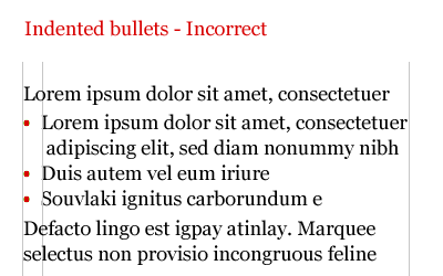
A ranged left body of type is pretty much destroyed, aesthetically, when punctuation isn’t hung. The eye looks for straight lines everywhere, when type is indented in this way, it destroys the flow of text.
With Hanging bullets
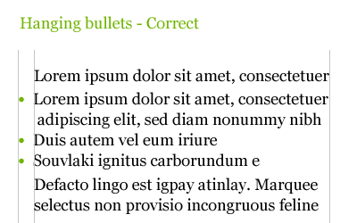
With hanging punctuation the flow of text on the left hand side is uninterrupted. The bullets, glyphs or numbers sit in the gutter to highlight the list. This representation of a list is more sophisticated visually and more legible.
Pull-quotes
Without Hanging Punctuation
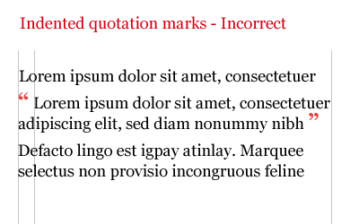
Nothing is more irritating than badly typeset quotes. The interruption to flow is considerable and the overall effect is pretty unsightly
With Hanging Punctuation
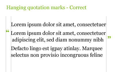
Quotation marks should be ‘hung’ — See diagram below. In this example the quotation marks are hung either side of the quote. Once again this allows uninterrupted reading for the audience.
Hang it!
So, in short. Hang lists and hang quotation marks, when using pull quotes and quotes within a body of text.And before you say “Mark, you don’t hang your lists on this site”, I will be, soon. The comments list is hung, I just need time to hang the bulleted lists… I get to it ok?
The series
This is the second installment of this “Simple Steps…” series. Next up we have Ligatures- Hanging punctuation
 I’m pleased this series is turning out to be so popular and it’s somewhat confirmed what I suspected. A bit of a thirst for simple typographic design theory.
The third installment of this series is dedicated to just one typographic element — Ligatures.
Ligatures are combinations of letters — some of them are functional, some are decorative. They are more commonly seen in serif faces, although ligatures in sans-serif faces such as Gill Sans and Scala Sans are important to the typeface and should be used.
They are generally comprised of certain characters which are created to stop collision of elements of letterforms. Take the letter f of a serif typeface. In lower case, especially italic, the top and tail of the f move into the character space next to it. These overlaps are what typographers call kerns.
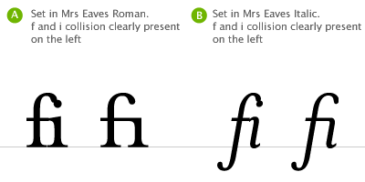
It’s when these overlaps collide with letters next to them that we have problems. Take lower case f and lower case i, probably the most widely used ligature. When set in Roman (A, above), the ascender of the f collides with the dot of the i, the effect is much worse when set in italic (B, above). Type designers therefore combined the character into the fi ligature. As you can see, the dot from the i is simply removed.
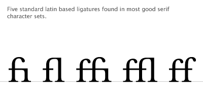
Ligatures and language have been closely tied throughout typographic history. Typographers in the sixteenth century devised ligatures to cope with common occurrances of letters in latin — fi, ffi, fl, ffl, ff (shown above). You will find at least a couple of these in most fonts. But, as langage has changed to encorporate different words, especially english, the need for more obscure ligatures has grown.
Take the word fjord for example. The ascender of the f will collide with the dot of the lower case j. This is resolved the same way as the fi ligature in that the dot is removed from the j. The trouble with less common ligatures like this is that they generally aren’t in the standard character set of a font, so we kind of have to make do or if setting type in a program like Adobe Illustrator, make them by hand. And this brings me neatly onto practical usage of ligatures.
Usage in print
I tend to use ligatures specifically for headlines. Occasionally, if the job demands it, I will use ligatures for body copy as well but this does tend to make typesetting a little time consuming.If for example I’m creating a logotype for a coffee shop called “Flow’s fine beans” (a convenient amount of ligatures present there!). The name could simply be set in a font which does not require ligatures, but this could make the logotype quite plain. The font chosen could be serif, but special care must be given to the kerning and overall appearance when setting logotypes that use ligatures.
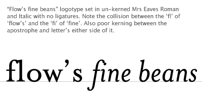
This logotype, shown above, is simply typed using Mrs Eaves. See how the ligatures appear too close to each other creating dense areas of type. The gaps between certain letterforms are also unsettling to the eye. This needs to be manually kerned.
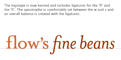
If the type is set carefully the ligatures add typographic interest to the words. They add character and begin to tell a story about Flow’s shop — it’s a classy place, nice coffee too!
So, careful attention to detail at this stage can help define a logotype and go a long way to help define brand message — all through the simple use of ligatures.
But what about on the web?
Usage on the web
Ligature usage on the web is a bit tricky. Functionally there are special characters for the following ligatures — these are needed for linguistic reasons.Æ | Æ | Capital AE |
æ | æ | Lower-case ae |
Π| Π| Capital OE |
œ | œ | Lower-case oe |
Ð | Ð | Icelandic upper-case eth |
ð | ð | Icelandic lower-case eth |
ß | ß | German double-s |
Þ | Þ | Icelandic upper-case thorn |
þ | þ | Icelandic lower-case thorn |
I tend to only use ligatures for on screen use if I’m creating logotypes, or graphical headers or elements that require them. In this instance all use of ligatures is fine. There are many people who disagree, stating that ligatures are a relic of by-gone age. I disagree. The use of ligatures in your typesetting, for print or on screen, shows a typographic maturity and an understanding of the craft.
The series
This is the third installment of this “Simple Steps…” series. Next up we have Typographic Hierarchy- Measure the measure
- Hanging punctuation
- Ligatures
 The final part in this series, I’m glad to say is a little more cut and dry than the last in the series. It’s more about historical typographic theory but with a simple, practical guide to ensuring a balanced use of typeface weights.
Solving the design problem
Let’s start by addressing the root of the decision to set type in different weights — solving a design problem. I mentioned that this problem stems from two main areas:- An aesthetic problem. This is where the designer sets type differently to add style or solve some kind of visual or compositional issue.
- A content problem. The designer needs to set a different weight because the content dictates it. The language of the content may dictate special typographic treatment, the tone of voice may be different, it may be a quote, it may be a structural device such as folios.
First off a bit of history
I like these history bits, they really are informative. To research where the rules came from and why they should be followed goes a long way to ensuring they are used.Uppercase and Lowercase, and the relationship between them, have been around for over twelve hundred years. Small Caps, ornamentals and arabic figures were early additions to the roman.
Italics were a strange bunch to begin with. They didn’t associate themselves with lower case roman, as we usually see today, but with roman caps and small caps. It’s only in recent times that usage of italic, within roman, was deemed to be typographically correct.
Some of the newest additions to the weights of typefaces came with bold, and condensed, as late as the early nineteenth centry. These were generally used in place of italics and small caps. Bold typefaces have now become a standard way of differenciating in typesetting, particularly on screen where italics are a little more difficult to read.
A type family with all of these weights forms a balanced series which is no only historically accurate but creates harmonious typography. If the setting of copy was reversed, so italics were used as body copy, Caps was used as pull-quotes and bold was used as access structure (folios, running heads etc) not only would the body of text look terrible, it was also be very difficult to read.
The practical bit
So, we have these weights of a typeface and they all relate to each other, and there’s a hierachy. How is this practical in everyday use?First off we need to show the different weights and how they are related to each other. Then we categorise them into a hierachical list, from primary to sextary. This is shown in the diagram below.
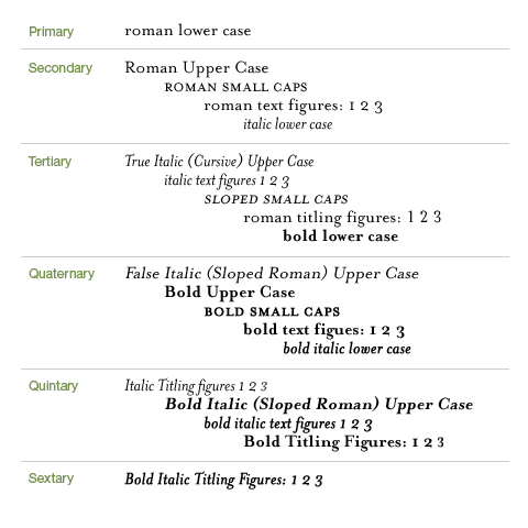
Execution of diagram inspired by Robert Bringhurst’s ‘Elements of Typographic Style’
This list, as it stands, may not be that useful. It does illustrate however the relative importance of certain typeface weights. It comes into practical use in the following diagram.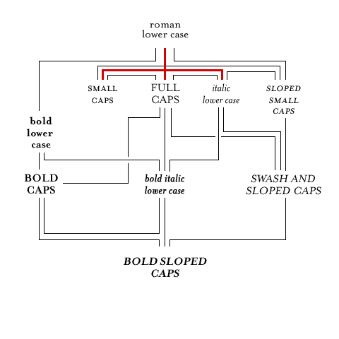
Execution of diagram inspired by Robert Bringhurst’s ‘Elements of Typographic Style’
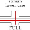
Here you can see some of the weights set out and joined by lines. The red lines represent the core typeface family. Some typographers would argue that without these core weights, typefaces are reduced to being used for titles only. I’ll leave that one open for debate!The other lines show how designers can move along the lines when setting type. for example, if a designer has set type in roman and they need to add emphasis to a certain point in the copy. They would follow the lines to any on the second line — bold lower case, small caps, full caps, italic lower case or sloped small caps. If they were to jump to, say, bold italic lower case, or a more extreme example, bold sloped caps, the effect would be horrible.
If the designer is setting type in bold lower case they could go on to add bold caps, or bold italic lower case without much bother. You get the idea?
So, following this simple roadmap can ensure that your typography adheres to some simple hierachical rules and as a result your typography will take on a harmonious feel. don’t just take my word for it though, set some type, use the rules and you’ll see.
A final word
I’ve enjoyed writing this series. What initially started as a quick five tips turned into something a little more involved and has sparked quite a lot of debate. I’m pleased it’s bringing traditional design stuff into the web standards realm, there really is so much more we can learn and put to good practice in this particular corner of the industry.Typography is one of those things that has unfortunately suffered from the advent of technology (and i’m not just talking about computers here). Designers on the whole have divorced themselves from the letterforms and the setting of them. As a result they’ve forgotten, or not been made aware of, the simple typesetting rules which were core to the old system of printers apprentice.
Typography to me is about design. It’s about words and the conveying of meaning. It’s about setting words that people read. A certain amount of it is creative, a certain amount is expression and aesthetics, but mostly it’s about people reading stuff. Do them a favour and don’t make it difficult.
This is the fifth, and last, installment of this “Simple Steps…” series.
- Typographic Hierarchy — weight
Metric typographic units
Typography is an old art. Long before the introduction of the international standard system of units (“metric system”), printing equipment manufacturers all over the world have established a bewildering variety units to measure length, many of which continue to be used today:- 1 point (Truchet) = 0.188 mm (obsolete today)
- 1 point (Didot) = 0.376 mm = 1/72 of a French royal inch (27.07 mm)
- 1 point (ATA) = 0.3514598 mm = 0.013837 inch
- 1 point (TeX) = 0.3514598035 mm = 1/72.27 inch
- 1 point (Postscript) = 0.3527777778 mm = 1/72 inch
- 1 point (l’Imprimerie nationale, IN) = 0.4 mm
- 1 pica (ATA) = 4.2175176 mm = 12 points (ATA)
- 1 pica (TeX) = 4.217517642 mm = 12 points (TeX)
- 1 pica (Postscript) = 4.233333333 mm = 12 points (Postscript)
- 1 cicero = 4.531 mm = 12 points (Didot)
The main problems are:
- The dominant unit of length, the Postscript point, has with 25.4/72 = 0.352777... mm a very inconvenient relationship to the most widely used length units (meter and millimeter).
- There exists no well-established practice for denoting a font size. [One example of a somewhat established convention is to specify the length of an “em” in PostScript points. Historically, the “em” was the width of the widest metal type in a font, which was for Roman fonts typically the capital letter “M”. Today, the control points of digital font outlines are stored in terms of coordinates inside a unit square. This square is a vague equivalent of the historic maximum metal type size and its side length has become the modern incarnation of the “em”. As a result, no easily measurable dimension in a text matches the point length that designates a font size]
- Resolutions of output devices are still frequently specified in dpi (dots per inch), which is the reciprocal value of the pixel size multiplied with 25.4 mm.
It is time that the typographic community finally abandons its current unit mess in two ways:
- adopt the metric system
- denote font sizes based on a measurable characteristic length of the printed glyphs
The German draft standard DIN 16507-2 suggests that all length measurements in digital typography should be specified in millimeters. It suggests further that dimensions should be multiples of 0.25 mm, or where a finer resolution is required multiples of 0.1 or 0.05 mm.
No more points, picas, ciceros, inches, etc. and all their awful conversion factors.
Japanese typesetters use the unit Q (quarter) for font sizes, where 1 Q = 0.25 mm, i.e. the same modulus recommended by DIN 16507-2.
This measure coincides nicely with the most common pixel size on computer monitors. For example a typical CRT screen has a display area of 320×240 mm, divided into 1280×1024 pixels, which makes each pixel 0.25 mm large.
Font sizes
DIN 16507-2
This draft standard defines (among many others) the following two font measures:- Font size (German: Schriftgröße)
- This is the baseline distance for which the font was designed. A font should normally be identified and selected by this size, because the intended baseline distance is much more relevant for practical layout work than the actual dimensions of certain characters.
- Font height (German: Oberhöhe)
- This is the height in mm of letters such as k or H. Typically, the font height is around 72% of the font size, but this is of course at the discretion of the font designer.
DIN 16507-2 contains a list of preferred metric font sizes, together with the corresponding preferred 72% font heights in mm. The table below shows, in addition to these values from the standard, the corresponding preferred 72% font heights in Postscript points, for easier comparison with the old font sizes. Note: the point sizes of US fonts do not always refer to the k/H height that is defined by DIN as the font height. Some font manufacturers (e.g., Knuth) also refer to the size of taller characters such as “(”, so be careful not to convert incompatible measurements. Instead, try to find out the baseline distance for which a font was originally designed if you want to convert properly to metric sizes.
Font Size   Font Height    |   Font Size   Font Height
      [mm]      [mm]  [pt]     |     [mm]      [mm]  [pt]
  -----------------------------+----------------------------
      1.5        1.1   3.1     |      6.0       4.3  12.2
      1.75   1.3   3.6     |      7.0       5.0  14.3
      2.0  1.4   4.1     |      8.0       5.8  16.3
      2.25  1.6   4.6     |      9.0       6.5  18.4
      2.5  1.8   5.1     |     10.0       7.2  20.4
      2.75  2.0   5.6     |     12.0       8.6  24.5
      3.0  2.2   6.1     |     14.0      10.1  28.6
      3.25  2.3   6.6     |     16.0      11.5  32.7
      3.5  2.5   7.1     |     18.0      13.0  36.7
      3.75  2.7   7.7     |     20.0      14.4  40.8
      4.0  2.9   8.2     |     22.5      16.2  45.9
      4.25  3.1   8.7     |     25.0      18.0  51.0
      4.5  3.2   9.2     |     27.5      19.8  56.1
      5.0  3.6  10.2     |     30.0      21.6  61.2
      5.5  4.0  11.2     |     35.0      25.2  71.4
(The above mm values are from the old DIN 16507-2:1984-05 draft. If you implement metric font sizes, please make sure you get the latest version of the actual standard from DIN.) Again: The font size refers to the baseline distance for which the font was designed, and is used to generally identify the font. The font height is the actual height of characters such as H or k. The font height is typically 72% of the font size as a preferred value, but this is of course left to the discretion of the font designer. One writes “Courier 6.0” to get the Courier font designed for 6 mm baseline distance (where the height of an H is typically 4.3 mm or 12.2 pt), and one writes “Courier 6.0/9.0” to get the same font but to use it with 50% more space between the lines.
Other proposals
Authors such as (Ó Brógáin, 1983) argue instead that font sizes should be based on the x-height. This clearly has a number of advantages:- The x-height can easily be measured directly in a sample printout and is not an invisible dimension found only in font data.
- Whether two fonts appear to have the same height is primarily determined by whether their x-heights match.
- The concept of x-height is also present in Greek and Cyrillic typography. Hebrew, Arabic and Devanagari glyphs can be aligned quite nicely with a Roman x-height, too.
- Recommended baseline distances are often related to the x-height (2 seems to be a very common factor), therefore using the x-height as a reference dimension will in practice often also lead to round measurements for the baseline distance.
- In some applications (e.g., traffic and warning signs in some countries), text is commonly written uppercase only, or consists only of digits, so there are no visible lowercase letters as a measurement reference. However, as the fonts used in these applications usually also include lowercase characters, therefore the x-height is always well-defined (except for some numeric-only display devices such as 7-segment LEDs).
- Chinese characters are more easily aligned with the H-height of Roman characters. However, as East Asian fonts typically also contain Roman lowercase characters, the x-height is always a well-defined quantity here, too.
Both x-height and the size of capital letters is an attribute stored in existing font files, therefore scaling font sizes such that the x-height or H-height matches a specified length in millimeters is quite trivial to implement on top of existing font management mechanisms.
An idea that might at least be worth considering is to define a series of preferred font sizes. Unlike the values given in DIN 16507-2, this could be a geometric series in which the quotient of neighboring sizes approximates a root of the square root of two. The international standard paper sizes were designed to be magnified and reduced by factors of sqrt(2) or sqrt(sqrt(2)), and for example standard technical drawing pen sizes follow the same progression. Such a series of standard font sizes could either be designated in a millimeter length and made available via pull-down menus, or it could be designated by an index number, as is already done for ISO paper sizes.
Metric device resolutions
Instead of giving a reciprocal pixel size in dpi, it would be much more convenient to specify the pixel size directly in micrometers, as it is also common practice in the semiconductor industry.The following table shows a few commonly used typesetting resolutions in both µm and dpi:
| µm | 10.0 | 20.0 | 21.2 | 40.0 | 42.3 | 80.0 | 84.7 | 100.0 | 250.0 | 254.0 |
|---|---|---|---|---|---|---|---|---|---|---|
| dpi | 2540 | 1270 | 1200 | 635 | 600 | 317 | 300 | 254 | 102 | 100 |
Metric modes in layout software
While US-originated typographic software frequently does allow to switch into some sort of metric mode, these metric modes usually have lots of loose ends and were obviously never used in daily work by their developers. Add-on metric modes often suffer from bizarre rounding bugs (you enter 210 mm and always get ugly 209.902777 mm displayed, alignments on metric grids do not work out, startup defaults are often fixed to US units, etc.), and the metric support stops at critical details like the font or pixel size, such that in the end metric users still have to constantly convert between millimeters, points, inches, and 1/inches. US developers should realize that over 95% of the world population grew up using the metric system and that it is therefore prudent to design a system today from the very lowest level up purely in metric units. Conversion to archaic units like the inch and the various points should only be an add-on feature in the user interface on top of an underlying purely metric architecture, and not the other way round.One font handling system design that got things right is the W3C’s CSS2 specification. Here, a DIN 16507-2 font description of the form “Helvetica 4.0/4.5” can directly be written as
P { font: 4mm/4.5mm "Helvetica" }
Also the ISO 9541 font file format uses millimeters to denote font design sizes (see ISO/IEC 9541-1:1991, section 8.6.17). Literature
The titles of some relevant DIN, BSI and ISO standards are- DIN 16507-1, Ausgabe: 1998-09, Drucktechnik – Schriftgrößen, Maße und Begriffe - Teil 1: Bleisatz und verwandte Techniken
- DIN 16507-2, Ausgabe: 1999-05, Drucktechnik – Schriftgrößen – Teil 2: Digitaler Satz und verwandte Techniken
- BS 4786:1972, Specification for metric typographic measurement (withdrawn)
- ISO/IEC 9541-1:1991, Information technology — Font information interchange — Part 1: Architecture.
Further literature:
- Ernest Hoch: International unification of typographic measurements. Penrose annual, Vol. 60, Lund Humphries, London, 1967, pp. 24-26.
- Ernest Hoch: Typographic metrication. Penrose: international review of the graphic arts, Vol. 70, Northwood Publications, London, 1977, pp. 123-135.
- Séamas Ó Brógáin: Typographic measurement: a critique and a proposal. Professional Printer 27, pp. 9-14, 1983, ISSN 0308-4205. (summarized in The Cambridge Encyclopedia of Language, p. 192)
- Josef Rommen: Typographic measures. In: Otl Aicher: Typographie. 2. Aufl, 1989, pp. 228-239. (bilingual: German/English)
- Friedrich L. Bauer: Der typographische Punkt. Informatik Spektrum, Vol. 22, No. 1, February 1999, pp. 41-42. (German)
You might also be interested in the International Standard Paper Sizes Web page.
Markus Kuhn

No comments:
Post a Comment