Wednesday, January 27, 2010

logo design history & Meaning

Amazon.com

Amazon.com logo
Now what’s so special about this? Just the name of the company with a normal swoosh – something which is used very often when it comes to logo designing. But wait a second, doesn’t that swoosh look like a smile? And it points from A to Z. That’s right, you got the hidden meaning. The arrow pointing from A to Z signifies what Amazon is famous for and that is selling anything and everything. The smile essentially implicates a customer’s emotion after shopping on the site and that is of happiness.

Baskin Robbins

Baskin Robbins logo
In the year 2005 this famous ice cream brand completed its sixty years. A part of the celebrations the ice cream company came out with a new logo. If one remembers the older sign had the number “31” appear on it’s logo with an arc which signified a scoop of ice cream. So have figured out what we are talking about or should I make it obvious. Well look closer the “31” is still there. It forms as part of the pink portion of the two initials of the company that are present in the logo.


Big Ten Conference

Big Ten Conference logo
Most of you must have heard about this academic union. This union, which was founded in the year 1896, has under it the top academic universities all over the world which share a common interest in research and development on the graduate and undergraduate level. From the year 1949 up till 1990, the big ten consisted of ten universities. On 4th of June 1990 it also included the Pennsylvania State University into the conference. The name of the union remained the same but if one is observant then the person could easily make out the number “11” over the blue region next to G and T.

Body Wisdom

Body Wisdom logo
This logo comprises two hands wide open and sticking to each other, and at the same time there are two white circles in between. These circles look something like an owl’s eyes. This spa centre is represented with hands, which basically play an important role at a spa, as they do the massage. The owl eyes here represent wisdom, which relates to the name of the company itself.

Eight

Eight logo
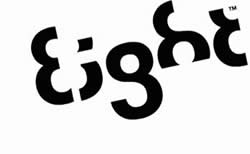
Very smartly designed, all that this logo required was the number “8” which has been very intelligently used to make the integrate the word eight in the logo itself. It also shows a very brilliant concept of how numbers can be used to write words. Very careful use of the number in only black colour gives the logo a stylish look. Anyone looking at the logo will not need a second chance to identify the brand and relate the logo to it.


Families and Marriage magazines

Families and Marriage magazine logo
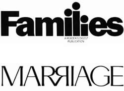
A very clear logo, it displays the special relationship between families and marriages through its letters. The lower case ’i’s in “families” are shown in three different sizes, representing the man as the longest I followed by the woman and the child. Moving on to the second word in the logo, the upper case “R”s mirror each other with their ends sticking to each other, representing the bond of a relationship. Altogether, the logo provides a very emotional appeal.

Forkwire

Forkwire logo
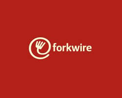
This online food delivery logo includes a combination of the internet key @ with fork in it, representing food as well as the first half of the name – fork, making the utilization of technology in food delivery very clear and obvious for the customers. Also, a white writing on a red background is catchy enough for the customer and gives an elegant look to the logo.


 FedEx
fedex logo
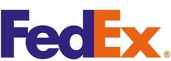
First look at the FedEx logo and you think what’s so unique about it? It is just a simple, you could say, a more or less textual symbol. But wait! Look closer. Do you notice a hidden arrow somewhere? This logo was created by Linden Leader & Landor associates in the year 1994 and on the first look comes forward to be a very simple design. But if you pay attention then you find that in between the E and the X is a right handed arrow. This hidden sign apparently signifies the precision and the speed at which this world famous courier company works.

Fuga

Fuga logo
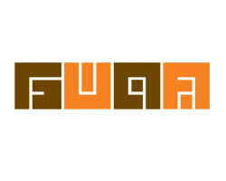
This is a logo for an architectural organization. The logo looks more like a maze in alternative colors of peach and brown. But if looked at carefully, the white stripes in the middle that look like the paths of the maze are the lines that form the name “fuga”. The font styling and use of colors does the work for this logo, thus making it interesting to look at.

GoodWill Industries

GoodWill Industries logo
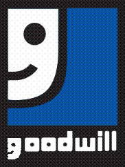
The GoodWill industries logo is a very simple combination of two bold colors, blue and black. However, one can see the intelligent designing of the logo by usage of just the lower case of the letter ‘G’- ‘g’ which is also the first initial of the company’s name. The lower case ‘g’ also represents a smiley face thus giving a very positive image to the industry. So even if you see the smiley face before the initial ‘g’, it simply means that GoodWill has goodwill.
 

Hartford whaler

Hartford whaler logo
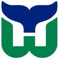
The name is very much present in the logo, with most of its important initials. On first look, you can notice the tails of a whale in blue, which connects to the name. A “W” of the Whalers is made in green, which holds an “H” inside it. The very cleverly opened logo spells out the name of the company, “Hartford Whalers”, making it a very indicative logo indeed.
 

Heartbeats

Heartbeats logo
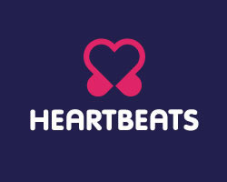
This brand holds a very obvious but cute logo, made out of musical notes joined at their ends making them look like a heart and headphones at the same time. This creates a strong link of the logo with the music as well as represents the love of music lovers. Use of soft colours like pink and purple gives a feeling of happiness and joy on seeing this logo, just like the one you get on listening to good music. The logo designed is simple but very relevant to the brand.

Lafyette Galleries

Lafyette Galleries logo

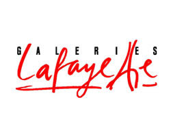
The very prominent cursive handwriting used to write “Lafyette” shows style and elegance in the brand. The two “t”s are tilted towards each other making a tower, which gives an indication of the origin of the brand. The “t”s represent the Eiffel tower, thus making Paris the home of the brand. Decent use of red and black leaves a stylish look with the logo, which goes hand in hand with the brand.

Mosleep

Mosleep logo
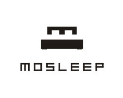
Mosleep as the name suggests is an organization of doctors that deals with people having sleeping disorders. The logo, for this company is an “M” that represents the initials of the company’s name. Along with representing the company’s name, the “m” also looks like a bed, which is very much in relation to the idea of sleeping, thus explaining the core concept of the organisation’s work, which is to deal with sleeping problems.

NorthWest Airlines

NorthWest Airlines logo
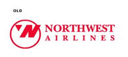
The logo shown on your left is the logo that was replaced a few years back with a new one by the airlines company. Well you must be wondering what is so special about this logo that has now been replaced with a newer one. This one is fairly easy to figure out. It is considered a piece of genius by many. The pink circle houses an N along with a W with a pointer (compass) pointing to the North West direction.

Sun Microsystems

Sun Microsystems logo
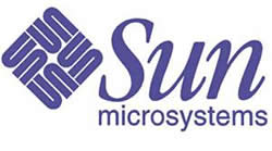
This masterpiece which was developed by Mr Vaughan Pratt – a professor at the famous Stanford University, successfully and beautifully integrates four interlocked copies of the keyword “sun”. This logo is a perfect example of an ambigram – which is defined as a typographical work of art which can be read as one or more than one word in its original form and also from other angles and viewpoints.

Toblerone

Toblerone logo
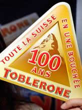
This world famous chocolate with a triangular shape was produced in the year 1908 by Theodore Tobler and Emil Baumann in the city of Berne, Switzerland. In the year 1970, the Matterhorn Mountain was included into its logo. Today the latest version of the logo consists of a bear camouflaged in the mountain. Is there anything significant about the bear? Well, YES! The bear is the symbol that signifies the city of Berne which is the birthplace of this chocolate.

Yoga Australia

Yoga Australi logo
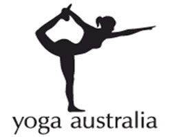
At first, the logo appears to be of a girl doing yoga, but on careful observation, one can see the map of Australia where she holds her leg in the air. A very beautiful concept has been displayed in the logo, where an attempt of holding the nationality of the brand along with the logo is made. The posture of the girl has imbibed in it the map of the country the company belongs to. From what we can see, the attempt has been successful.

ZIP logo

ZIP logo
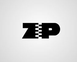
This logo is very simple and clear in reference to the brand name. The drawing of a zip in place of an “i” shows very obvious display of the company’s name. The designer Mark Erickson uses the zip in the “i” to connect Z and P. Raw use of black and white adds to the seriousness of the brand. The logo is very precise, simple and to the point.

Pakuy

Pakuy logo
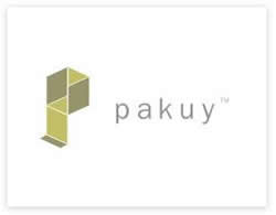
Designed by Maumer, the logo of this company consists of a simple “p” made of unfolded carton cover or a broken box, thus representing the work of the brand which is packaging. The letter ‘p’ is also the initial of the company’s name and it thus suits the name as well.


Eighty20
Eighty-20 is a small consulting company which does sophisticated financial modeling, as well as some solid database work. All their work is highly quantitative and relies on some serious computational power, and the logo is meant to convey it.
Cluenatic
This was a logo created for a puzzle game called Cluenatic. This game involves unravelling four clues. The logo has the letters C, L, U and E arranged as a maze. and from a distance, the logo looks

Elle Hive Logo

Designer - Toni
It is a company which designs compact tractors. The letters “E” and “H” make up the image of a tractor.


Toblerone Logo

One of my favorite chocolates…yummy!! But trust me I never noticed the brilliant logo while enjoying my bar. You must be thinking what is there to find out as it clearly shows the Swiss Alps? Let me explain…Toblerone originated in Bern, Switzerland - A city whose name is rumored to mean, “City of bears”. When you look at it again you will find a bear in the logo.

Logo !N3K8


The complexity of this logo is its beauty. It is a business and IT consulting company based in the UK and the logo is a combination of numeric and alphabets to explain the word “intricate”.

Review Logo

Designer - Sean Farrell Logo Design:
When you take off a piece of the “v” in the word “review” it forms a check mark (for review). Simply amazing!!

Hartford Whalers


The logo shows 3 concepts at the same time. A whale’s tail, letter “W” in green and the white space forming an “H” for Hartford.

VIA Rail Canada Logo


Notice carefully…the VIA rail Canada logo makes two train tracks with the letters” V” and the “A”. The alphabet “I” is the division between the two. A simply brilliant logo.

Piano Forest Logo

Designer: Jason Cho
The designer gives the message in a subtle but evident manner by shaping piano keys like trees to resemble a keyboard/piano.


ED Logo: Gianni Bortolotti

Designer - Josiah Jost
The designer of ED Logo – “Elettro Domestici -Home Appliances” in English, changed the concept of traditional logo designing through this logo. The designer has amazingly used the negative space to demonstrate the letter “E” and “D” making the logo look like an electric plug.

logo design history (X)


Xerox Logo Design

Xerox Logo Design

Xerox Corporation can trace its history back to 1906 when the Haloid Company was founded to manufacture and sell photographic paper and equipment. The company decided to change its name to "Haloid Xerox" and then simply "Xerox" in 1961. In 1938, Chester Carlson developed a photocopying technique called electrophotography (xerography). The company began to come into prominence by 1959 with the foundation of the first paper photocopier using the technique invented by Chester Carlson. Development of digital photocopiers and a revamp of the entire product range in the 1990s, gave Xerox a technical lead over its competitors. In 1961 Lippincott designed the original Xerox logo after the company had dropped the Haloid from its name. Chermayeff & Geismar updated the block-capital-letter XEROX wordmark seven years later. The logo changed to red in 1994 and Landor introduced a corporate signature along with the digital X to symbolize the transition of documents between digital worlds and the paper. The logo emphasized the wordmark "Document Company" since that was the original focus of the company, which manufactured and sold multifunction systems, color and black-and-white printers, digital production printing presses, photo copiers and related services. "The Document Company" signature disappeared in 2004. Four years later in 2008, Xerox tried to get away from the "the copier company" image and redesigned the Xerox corporate logo. The new identity, designed by Interbrand was created to represent the connection to partners, customers, industry and innovation. Some early reviewers feel that this logo is not a notable improvement and that it looks like a Beach Ball or peppermint candy. Come to think of it, it does take your mind off of "the copier company". But not with good thoughts.

logo design history (Y)

Yahoo Logo

Yahoo Logo Design

The main concept behind Yahoo! was born when its founders Jerry Yang and David Filo initiated a guide on their personal interests. The world wide success of the company was based on its goal to "connect people to their passions, their communities, and the world’s knowledge" and the careful nurturing of its brand identity. In 1995 Yahoo! developed into a corporation and decided to express through the logo the company's idea and mission. The word "Yahoo" stands for "Yet Another Hierarchical Officious Oracle" but it also means rude, vulgar and unsophisticated and the two students loved the idea. The red colour used for the Yahoo logo, also complimented the yahoo's definition. The former version of the logo has now been revised into a purple colored icon with variations that include Y!Bang logo and white logo.
Yamaha

Yamaha

This global Japanese company manufactures and sells a range of products including motorcycles, boats and boat engines, snow mobile and golf karts, and music instruments and audio equipment, as well as robots and computers. The business was created in 1887 in Hamamatsu, Japan. When it was first opened, Yamaha initially repaired musical instruments prior to manufacturing its own organs in 1889. Further on from this, the company created "Nippon Gakki Seizo Kabushiki Kaisha" which literally translated to "Japanese music instruments corporation." The logo of the company is representative of a light that has three crossed tuning forks. This is indicative of inventor Torakusu Yamaha's restoration of musical instruments.

logo design history (W)


Wella logo

Wella logo

Wella really came into play as its own brand in 2003, when Procter & Gamble took control of these world famous and highly successful manufacturers of hair care products, who had been around since 1971. In addition, Wella also manufactured hair curling devices and hair dryers, and as such, the logo was developed to represent a woman blowing her hair.


Wilkinson corporate logo

Wilkinson corporate logo

The image used by this company dates back to the year 1772, when the sword maker Henry Nock of London opened a small business. The business was taken over in 1805 by Nock's son-in-law James Wilkinson. The company was eventually renamed in 1887 as the "The Wilkinson Sword Company." Initially the company was set up to manufacture everything from typewriters to bicycles and motorcycles, prior to moving in to the electric shaver in 1898. The logo we see to the left goes all the way back to the heart and founder of the company - Nock - who was a sword maker. In addition, it still maintains its relevancy on the basis of the company's continued efforts in manufacturing and selling razor-blades and razors.


Winter Games 2010 Logo

Winter Games 2010 Logo

The logo for the 2010 Vancouver Winter Olympics was presented to the public in April 2005. It was designed by Vancouver resident Elena Rivera MacGregor. The logo’s name - Ilanaaq the Inukshuk. It was chosen from 1,600 entries. Ilanaaq means “friend” in Inuktitut, the traditional language of the Inuit (also known as Eskimos). It is one of three languages spoken in Nunavut, Canada, which in 1992 became a self-autonomous region of the country. Inukshuk refers to guiding stone markers that Inuits use when exploring the Arctic. The logo was viewed by many as a friendly and welcoming symbol, which is what the Olympics have come to signify, and which, by extension, seemed to be the most appropriate for Canada. There are five separate stones in five colors: blue and green symbolise Canada’s west coast region, mountains and rivers. The red stone symbolises the Maple Leaf, Canada’s flag, and the gold (yellow) signifies the sun that shines on Vancouver’s downtown area and surrounding mountain ranges. Note the green stone that is shaped like a smile echoing the meaning of Ilanaaq - friend. The emblem means that all stones need each other to convey strength and support. One of the judges said, it was a logo that: (a) had appeal with young people; (b) represented the Canadian personality accurately; and (c) the message of the symbol seemed to be saying, here’s the way to the finish line. The Olympics logo itself has five interlocking rings designed by the founder of the Olympic Games, Pierre de Coubertin in 1913. The five rings, first introduced in Belgium, represent the five continents. Coubertin explained, the emblem chosen to illustrate and represent the world Congress of 1914, five intertwined rings in different colours - blue, yellow, black, green, red - are placed on the white field of the paper. These five rings represent the five parts of the world which now are won over to Olympism and willing to accept healthy competition. The rings are permanent symbols but countries hosting individual games can come up with their own emblem provided the five rings are included.

logo design history (V)


Vaillant logo

Vaillant logo

This colloquially known "Hare in the Eye" is promoted by one of Europe's most renowned and respected heater manufacturers, who have been in business since 1899. The idea for the concept, the logo, and the business dates back to the company's founder Johann Vaillant at the Ostersonntag, when he was reading a Catholic news sheet. This news sheet was the inspiration for the logo and peoples desire to be surrounded by fascinating things such as trees, eggs, hares and rolling lawns.


History of Logos

Valiant Comics Logo Design

Valiant Comics is the comic book publishing company established in 1990 by comic writer Jim Shooter and famous artists Barry Windsor-Smith and Bob Layton. Valiant Comics stormed onto the comic book market with stories and characters of unique quality and became one of the largest players in this industry. Valiant is the 3rd most recognizable world of characters in comics. The quick rise of Valiant can be ascribed to both the blemished realism of its characters and the quality of its stories. Valiant's first visual identity appeared on Wrestling and Nintendo Comics. In 1991, the logo would also appear on its superhero line. Two months after the end of the Unity crossover, Valiant updated its logo, switching from a fancy script font to a bold script. The new Valiant logo was updated again right after the Chaos Effect crossover. The company decided to change the wording to "Valiant Presents" and to decrease in size the compass logo. The logo was entirely revamped after the company has been bought by Acclaim Entertainment. It featured a large letter "V" to replace the compass, and a new different typeface. Later on, a new logo was created to symbolize the synergism between Valiant and Acclaim, merging the letters "V" and "A" into one logo. The compass logo has lately reappeared along with the addition of the wording "Entertainment".
 
VW-logo

Volkswagen Logo

Volkswagen is a car producer based in Germany. It forms the substance of Volkswagen Group, which is the world's fourth largest automobile producer after Toyota, GM and Ford. The origins of the company date back to 1930s Nazi Germany. Long before Hitler was elected to power in Germany, he was creating schemes to mass-produce an affordable car. Hitler called the new vehicle the "KdF-Wagen", which literally meant "strength through joy - car", after the Nazi-led KdF movement that was supposed to look after the working people. Ferdinand Porsche disliked the name KdF-Wagen (he preferred Volkswagen, the name under which the car had been produced). "Volkswagen" signifies "people's car" in German, in which it is pronounced ['folksvagan]. Volkswagen has one of the most simple and instantly recognizable logos in the world, which has seen subtle changes through the years. It's pretty obvious what the Volkswagen logo is (a V over a W in a blue background, surrounded by a circle). The logo was the result of an office competition of which the winner was Franz Reimspiess (the engineer who perfected the engine for the Beetle in the 1930's). The copyright holder of the internationally-famous VW logo is not to be Nikolai Borg, a graphic designer who sued the company for allegedly failing to recognise his work.

logo design history (U)


Umbro

Umbro

In 1924 the Humphrey Brothers created a sporting and clothing manufacturing firm along with a logo depicting a double diamond, which was directly representative of the two founders Harold and Wallace Humphrey.


Uncle Ben's

Uncle Ben's

In 1943 the American company Converted Rice Inc. from Houston, sold and transported high-quality rice. The label and logo name were based on the local farmer Uncle Ben, whose rice plants in the area around Houston were tended with great love and care in order to produce such a high-quality product. The label and logo however, is based on a fictitious picture of Uncle Ben, as no authentic picture or photo was ever taken of the legendary rice grower.


Unity Symbol

Unity Symbol

This logo was taken from one of the oldest but most common symbols. The image represents the two symbols Mars (meaning masculinity or War God) and Venus (meaning femininity or Dear Goddess), which was first used in about 450 B.C., according to Greek mythology. Even today this image is still used and shows the link between man and woman. In more recent and modern times the two symbols have been linked together to show the unity between two or more people in a business environment. The symbol of unity demonstrates love, confidence, loyalty and solidarity.


UPS logo

UPS logo

The very first iteration of this logo for this famous and reputable express delivery service was developed 1919. This first version pictured an eagle containing a package in its claws. Eighteen years after this date, the logo was altered for the very first time. At to a shield with the three initials of the business name. In 1961 logo designer Paul Rand created a new logo in line with this new abbreviated name. The logo was again redesigned in 2002/2003 by FutureBrand and the new 3D look was placed on a brown surface of a shield.

logo design history (T)


Tchibo

Tchibo Business Logo

This internationally renowned brand was created in 1949 by Carl Tchilling Hiryan, who initially sent a parcel of roasted coffee beans through the post to a customer. Following on from quick success, between 1995 through to now, the business has more than 850 sales branches where coffee products are offered for sale. The logo and business name is abbreviated from "Tchilling Hiryan" and the word "bean" - making the word "Tchibo."


logo designs texaco

Texaco Logo Design

Texaco is an American oil retail brand that provides quality gasoline and is a leader in the market in performance. Texaco is known today as one of the most iconic brands around the globe. The company's original five-pointed star logo design was created in 1903. The first trademarked logo, designed in 1909, featured a red star (a reference to the lone star of Texas), leading to the advertising jingles "You can trust your car to the man who wears the star", and a green T which all over the world, means superior quality. The Star Symbol and Texaco Logotype are Texaco's major retail brand identifiers. The trademarked logo design was created by Romeo Miglietta who based his design on the colors that embellished the Italian flag. The Texaco logo was updated in 1913 and a 42-inch double-faced sign was introduced. In 1963, with the launching of the company's first corporate identification system, the circle was replaced by a hexagon. The company introduced the streamlined star symbol in 1981 along with the new System 2000 stations. Texaco updated its corporate identity in 2000, after deciding that the star symbol no longer needed the wording Texaco below it.


Texas Instruments (TI) logo

Texas Instruments (TI) logo

This company was first created in 1930 by John Clarence "Doc" Karcher and Eugene McDermott. It was created to serve as a geographical service that used Seismology. Over time, the focus of the company moved to the production of transistors and other instruments, which is why the company became Texas Instruments in 1951. The logo depicts the outline of the State of Texas, and an outline of the initials of the company's name.


Three M logo brand history old logos

Three M Business Identity

This innovative and ground-breaking American company was the brain child of five successful business men in 1902. The men initially formed the "Minnesota Mining and Manufacturing Co." and, when mining showed little promise of offering them a return, they looked for further opportunities. After stumbling around looking for new products potential one of the owners coincidentally came about the idea of sandpaper. Other ingenious ideas by this company include Scotch tape and Post-it notes.Some say that 'simple is smart.' That's been one of the keys to the success of the 3M logo. 3M Red is a bold, vibrant color that makes the logo recognizable and unforgettable. Trough the time the 3M logo has gained awareness and familiarity in every corner of the world; it has become a symbol for innovative, trustworthy products and services. But it wasn't always that simple. The three "M"s come from the "Minnesota Mining & Manufacturing Company." Through the first 50 years of the company's life, logos transformed rapidly. The first appeared in 1906. Its design was complex: The company's full name and its headquarters (Duluth, Minn.) surrounded a diamond containing the term "3M Co." After this version the logo went through many changes in some cases, the oval being completely abandoned for a plain stand- alone 3M. An important phase in 3M logo evolution began in the 60's when the company hired Gerald Stahl & Associates, a New York design firm, to create a definitive logo that would connect the corporation and all its business units under a single sign. The result was a boxy, 3M with a distinctly industrial look. Things changed in the 70's as the company's focus were no longer the industrial abrasives and tapes but products for commercial and consumer markets. The result was the new 3M logo 'simple and smart': red 3 and M touching one another. The new, vibrant logo caught on like wildfire.
 
ThyssenKrupp logo

ThyssenKrupp logo

The current day logo of ThyssenKrupp represents the merger of the two steel dynasties of the families Krupp and Thyssen. During 1811, the two partners built a factory for casting steel of English quality. They worked together and independently, including in 1871 when Thyssen left the business, in order to produce strap iron work. After many years and turbulent times including the Second World War, both companies continued to work together. A new logo was introduced in 1920 and was based on a circle, polygon and letter combinations. From the initial letter a "subtle T" was developed to combine with the traditional characters of the two businesses that had merged. Discussions of the managers in 1976 saw the introduction of a new logo that contained the Rhine steel elbow that you see now. This was designed to be used as a uniform symbol for the entire business and was deemed to be the "yellow signature." As the business progressed, the "yellow signature" was replaced "by the blue signature" but the colors of blue and yellow were selected as the corporate colors for the business. Introduced in 1875, the three rings represent the time that Alfred Krupps invented the forged and rolled railway wheel tire, which was patented and trade marked in 1853 in Prussia. The manufacture involved three layers positioned on top of each other. The law around trademark protection in 1874 gave Krupp the permission to develop its own logo at which time a selection of drafts were made. Hence this three ring character in a pyramid shape is interpreted as wheel tires of railway wheels and was first used in 1875. 1994 saw the end of the logo in its original form, and at that point a more modern version using black rings came into play. This new logo is not intended to replace but instead combine all of the previous facets of the logo in all its iterations. All employees of the company were recently asked to make suggestions for the development of the logo and more than 5,000 suggestions were supplied. This gave the company a strong indication of the level of commitment from its workforce.


Toyota corporate logo

Toyota corporate logo

The Toyota logo, like the company, is widely recognized for its originality and simplicity. It has become a symbol of pioneering automotive and non-automotive products and services. The Toyota logo bears a meaningful visual identity with strong visual impact. It symbolizes the energetic transition of the company from a family business to the expansion of a worldwide company. In 1936, when Toyoda Automatic Loom Works Ltd. was launching its first passenger car, it needed a new trademark to celebrate the launch. For that purpose, a competition was held to establish a logo that would promote the company's vehicles. The design requirement of the company was to create something that will express 'the feeling of speed'. Thus, the winning logo resulted in the change of the name from 'Toyoda' to 'Toyota'. This was as the Japanese lettering of 'Toyota' gave the logo a smooth look and was also chosen because in the Japanese word 'Toyota' (eight) was considered to bring luck and prosperity. Although no longer used on products, the original Toyota logo is still used as the company's emblem. The current Toyota logo consists of three ovals: two perpendicular center ovals making a stylized "T" for Toyota and one around them symbolizing the global expansion of Toyota's technology and unlimited potential for the future.


Trumpf logo

Trumpf Company Logo

This well known brand dates back to the year 1923, when Christian Trumpf and two of his business partners opened a mechanical workshop. Over the years this business grew in spades. In 1948 they opted to use the surname of one of the owners along with a spade from a deck of cards to build their brand.